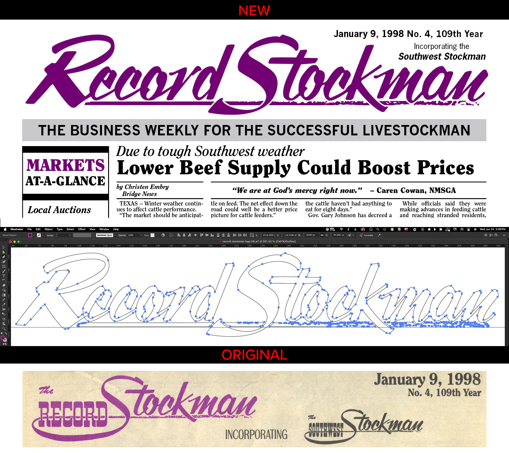
This example is my simple, but necessary improvement to the original logo (bottom). I enlarged it to fit across the top of the publication for better recognition, especially from a distance.
The "Southwest Stockman" was minimized as it is a minor detail to the publication and didn't justify the valuable space on the header of this front page. It was also too similar to the already overly small main logo.
I had to manually recreate this in Illustrator as the original font was not available, even as a reference. The "R", "e", "r", and "d" are completely new, based on the "Stockman".
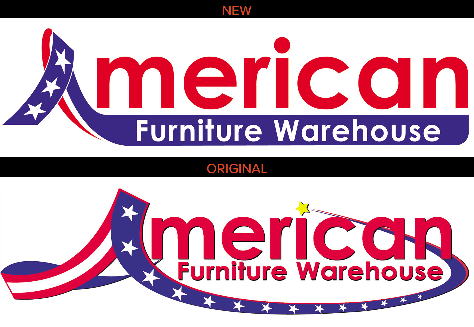
This new version of the American Furniture Warehouse logo is just a concept by me, because I am annoyed at how the logo that is used is so unreadable from a distance, which is problematic as it is on all of their signage.
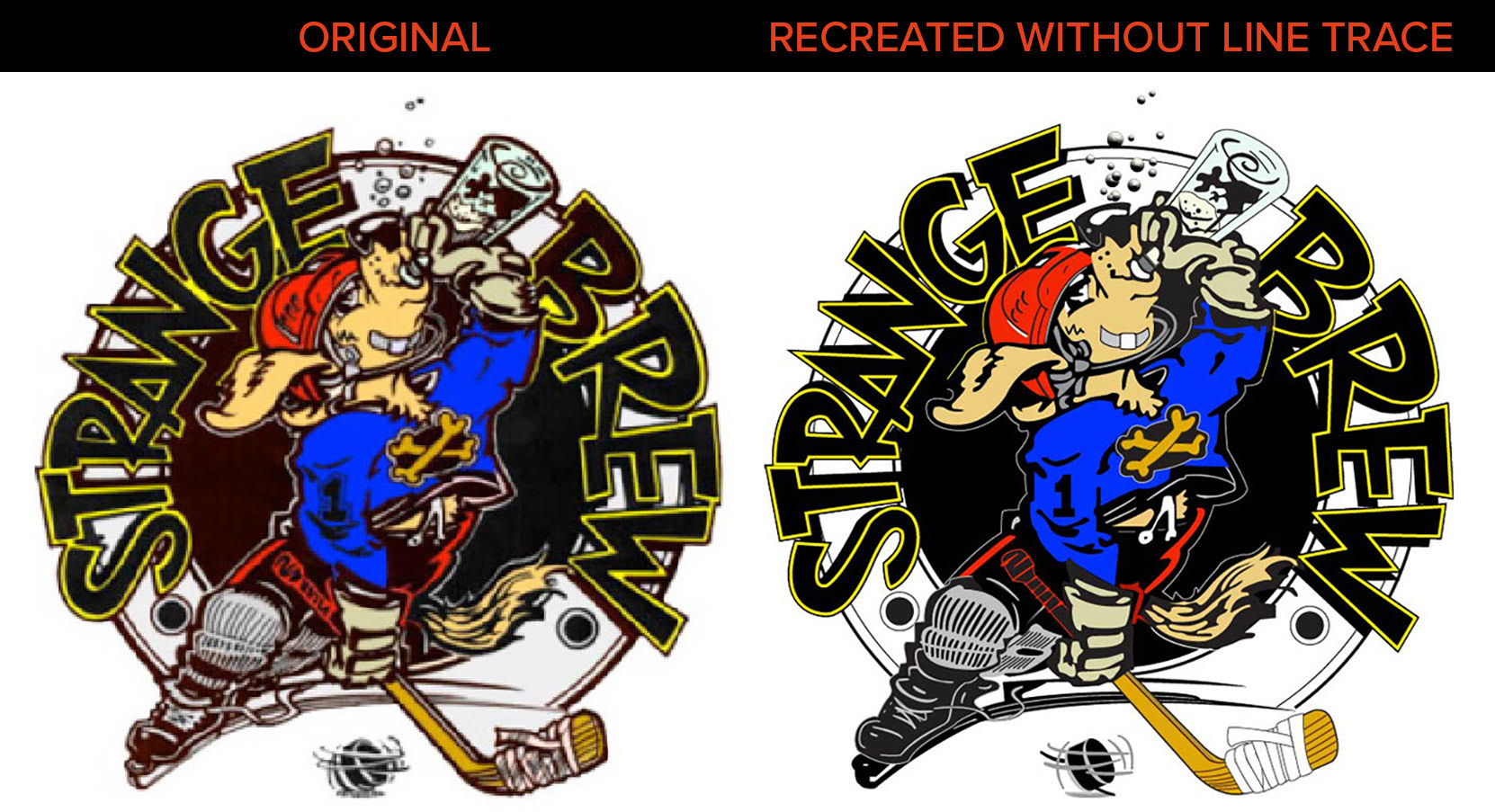
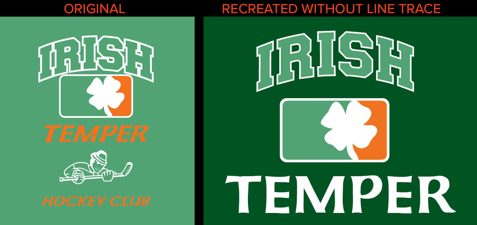
The logo on the left is a scan of a sticker, which was recreated on the right, without using Image Trace.